OVERVIEW
Target users:
Primary users are engaged couples and wedding coordinators managing event planning and task organization.
Secondary users include event team members such as assistants, catering staff, and hostesses who require clear task distribution and real-time coordination.
My role: UX Researcher & UX/UI Designer
Responsibilities:
User research • Wireframing • Prototyping • UI design
• Usability testing • Iteration & refinement
Tools: Figma
About product:
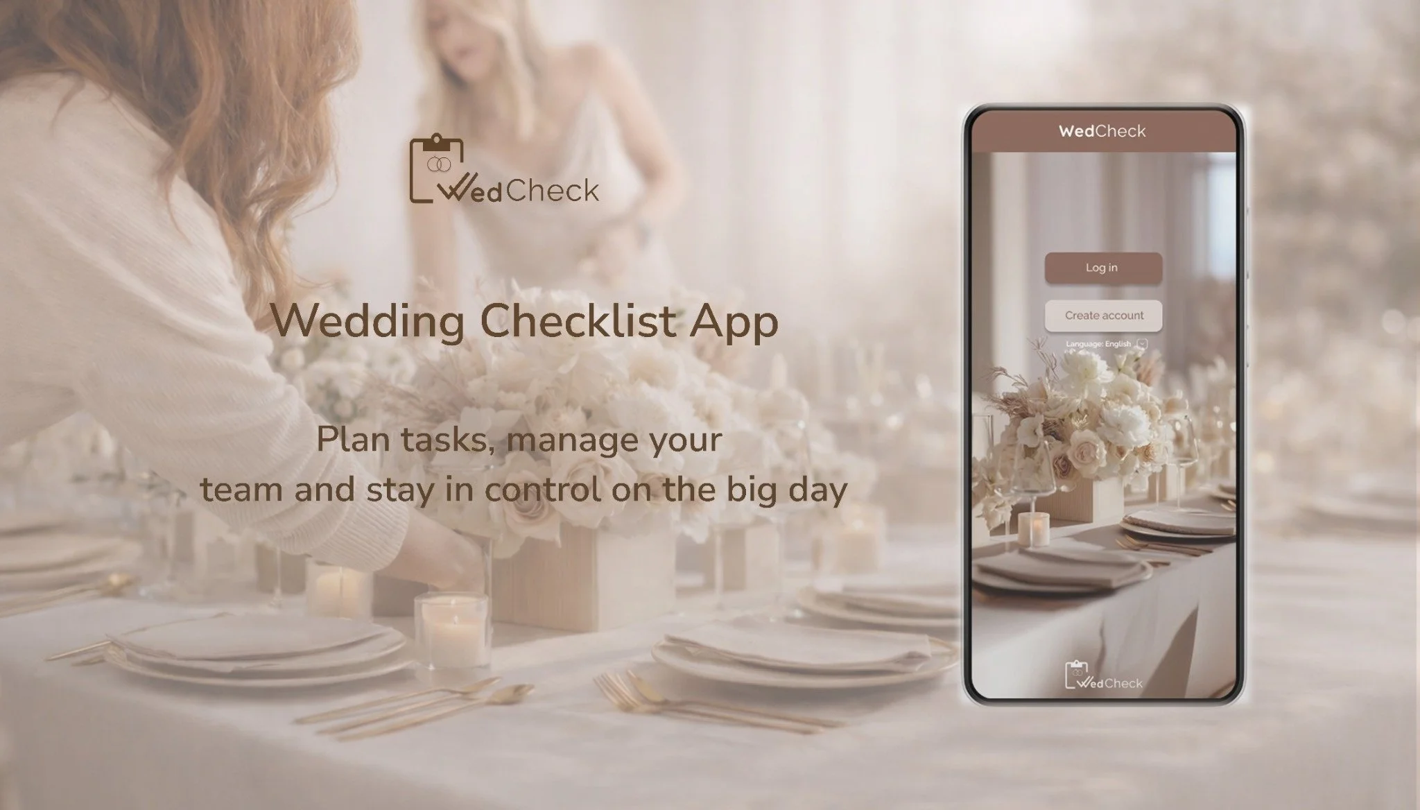
The „WedCheck - Wedding Checklist App" is designed to simplify wedding planning through customizable task lists and direct real-time communication. The app is intended for both individuals and wedding planning teams.
Problem:
Couples and wedding planning teams struggle to manage tasks, deadlines, and responsibilities during event planning.
Goal:
To create a user-friendly checklist app that simplifies wedding planning through clear task management and team collaboration, tailored specifically for venue-based events.
From Research to Design
Below is an overview of the design process and key decisions behind the project
Case Study Phases
*Click a phase to navigate to it, or scroll to follow the process.
1. RESEARCH
Understanding users is a fundamental part of the UX design process
For this project, I interviewed couples and wedding staff (waiters, chefs, decorators, and wedding coordinators) to understand how they organize tasks, assign responsibilities, and manage deadlines.
Initially, I assumed users mainly needed a simple wedding planning checklist. However, research showed that the real challenge was coordinating and delegating tasks within a team, shifting the focus to a collaborative task management solution.
Research Approach
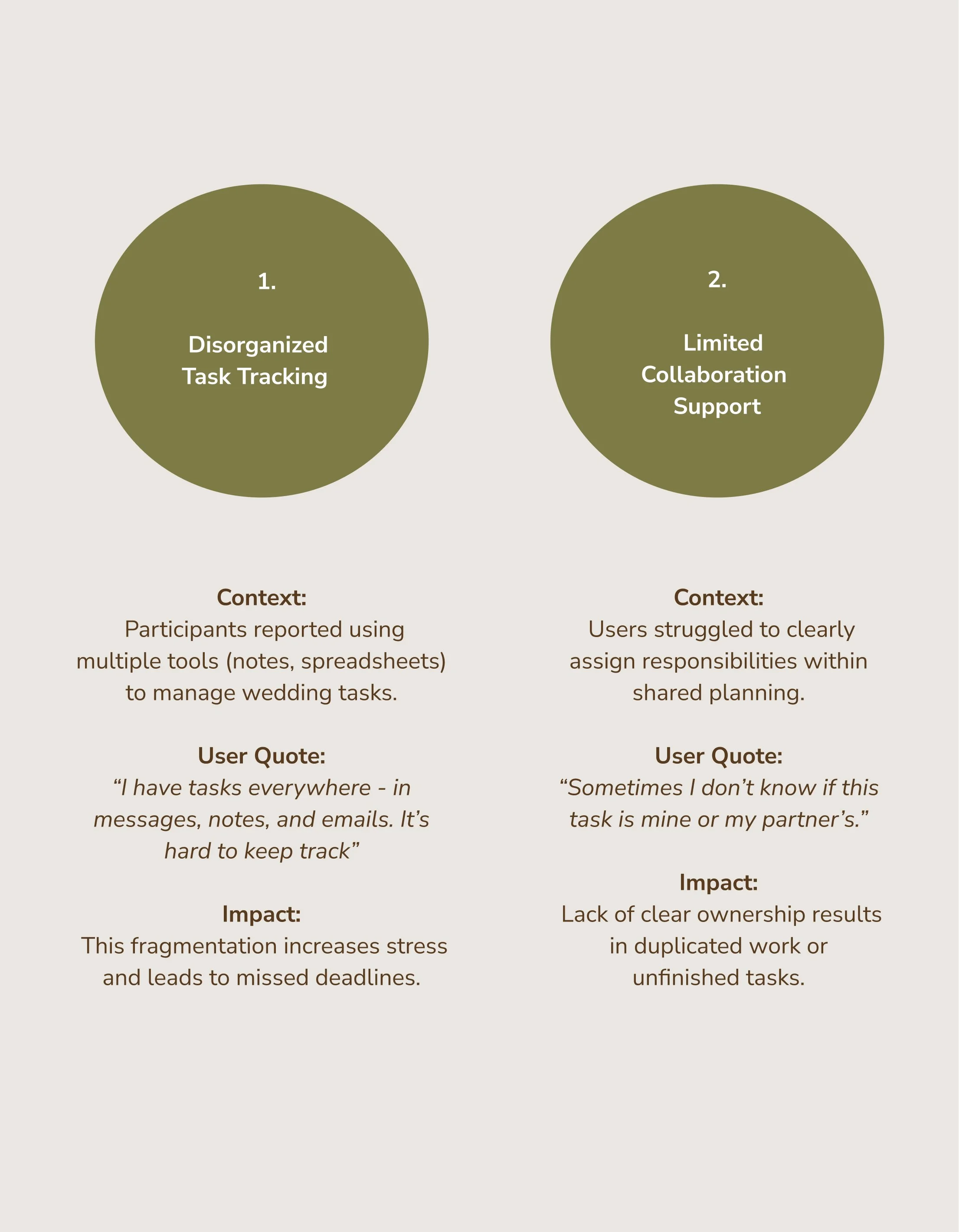
Task ownership was often unclear
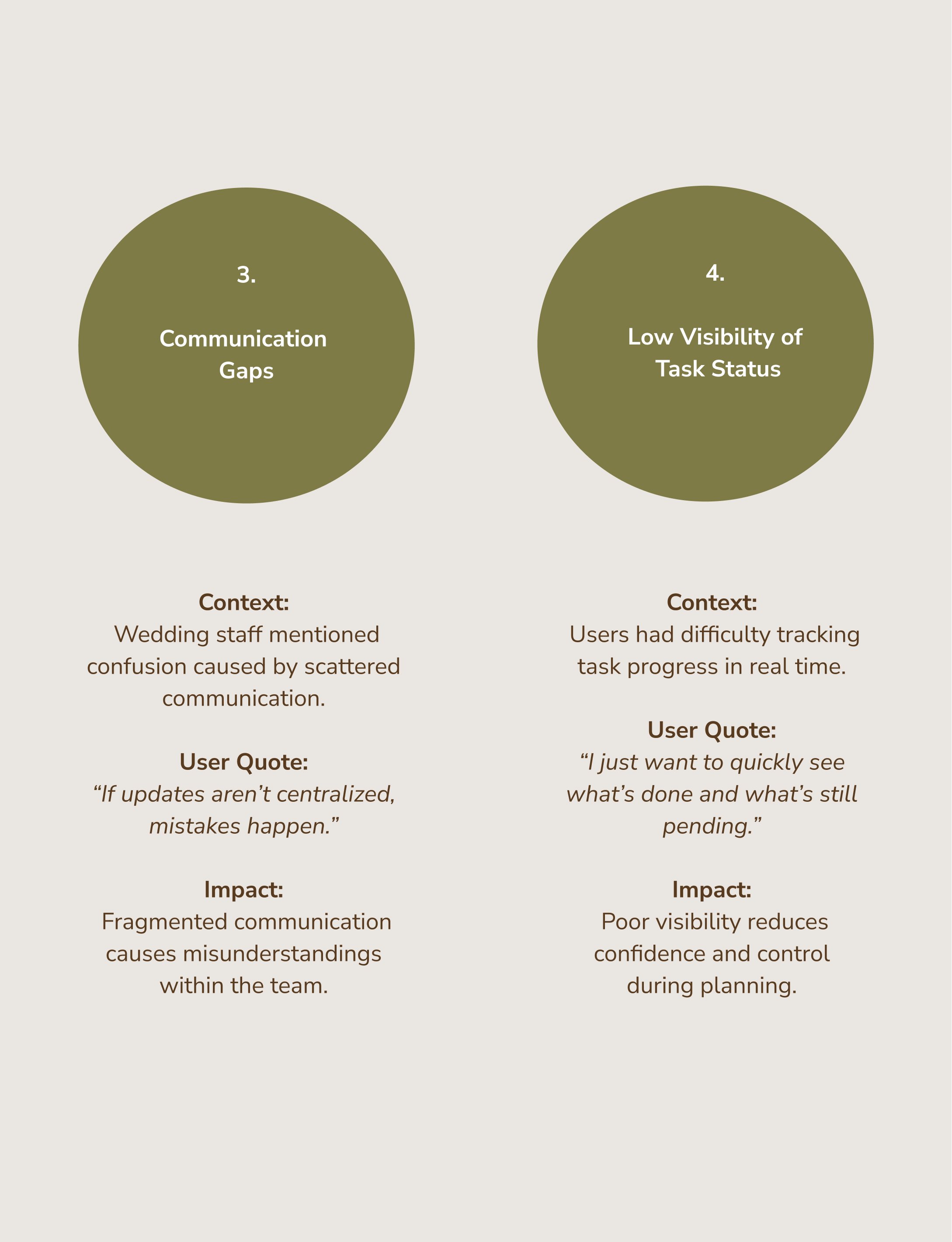
Communication was fragmented
Users lacked visibility into shared progress
Existing tools focused more on individuals than collaboration
Research Objectives
Understand current wedding task planning behaviors
Identify coordination and communication challenges
Explore pain points in existing tools
Define expectations for collaborative planning
Research Insights
Collaboration is more important than simple task tracking
Clearly defining the responsible person for each task reduces misunderstandings
Users need real-time visibility of progress
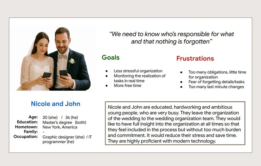
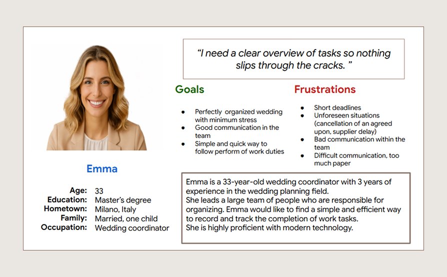
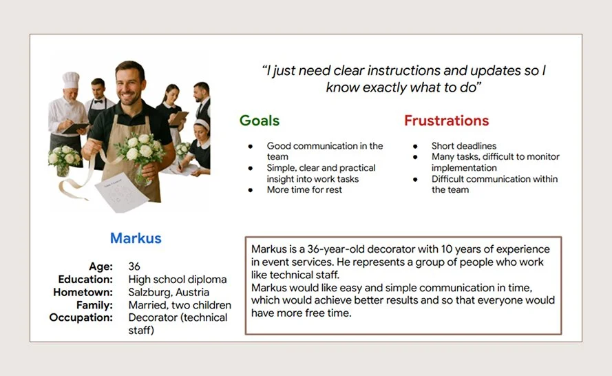
Personas
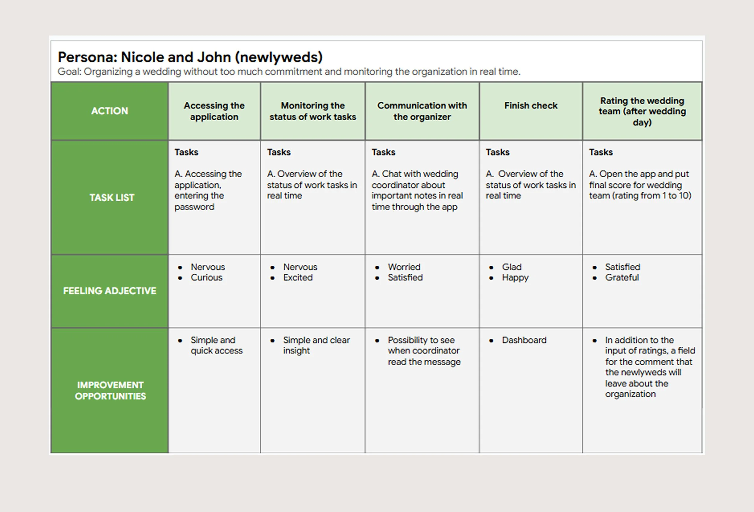
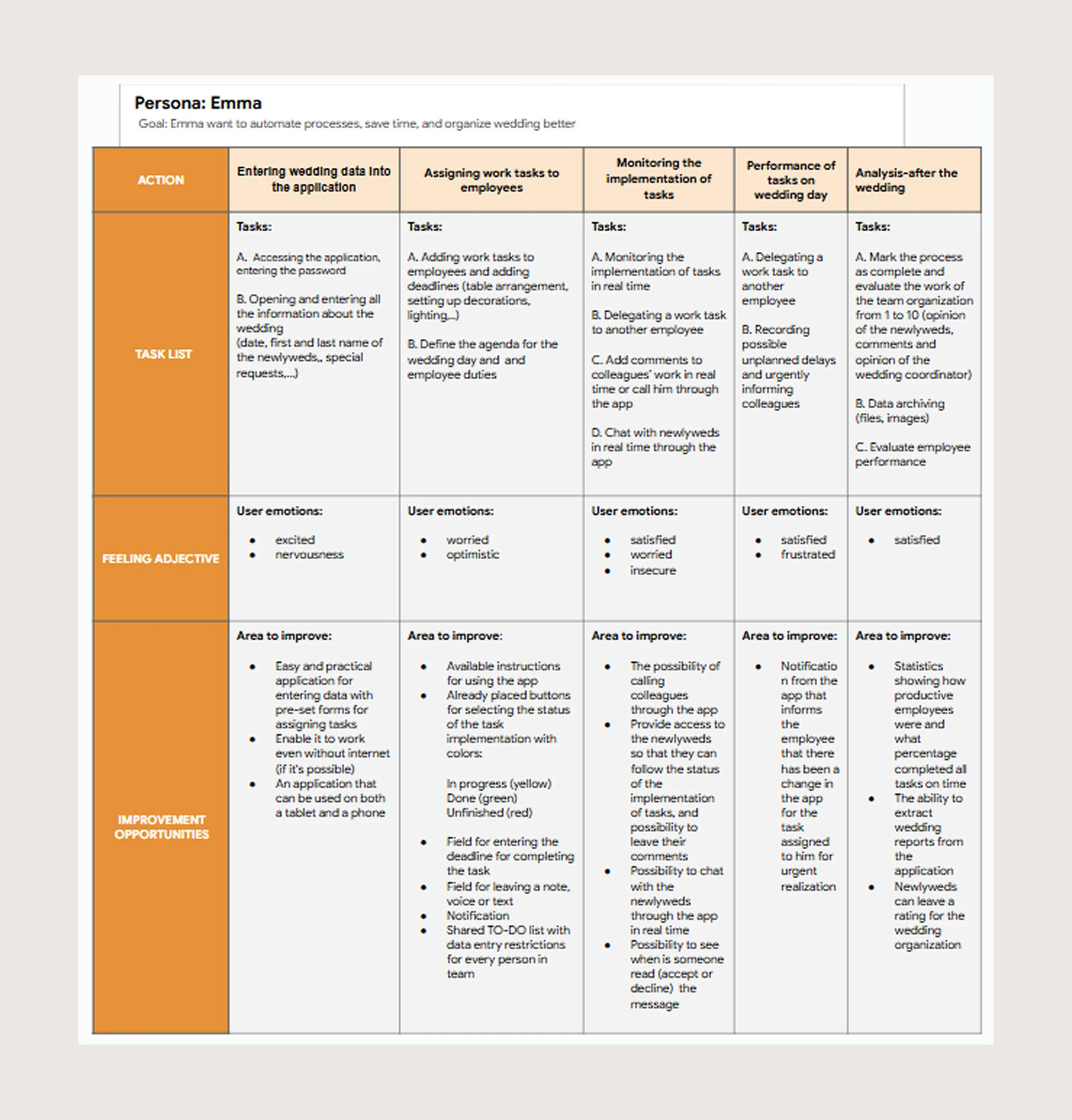
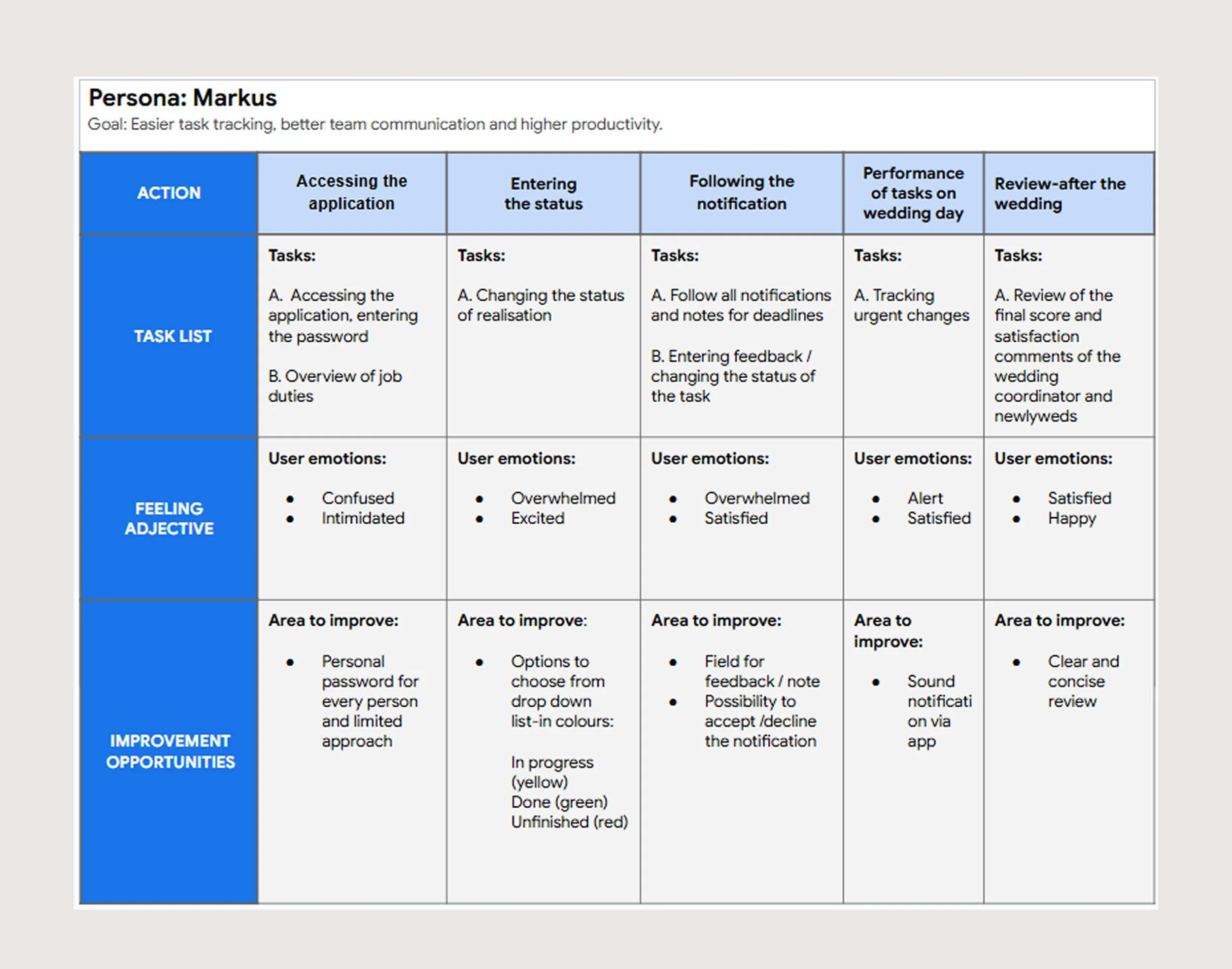
User Journey Maps
Pain points
2. DEFINE
This phase defines the core problem and sets the strategic direction for the solution
Based on these insights, the design goal shifted from a simple checklist tool to a collaborative task management solution that supports shared planning, task delegation, and clear responsibility tracking.
Problem statement
Couples and wedding teams
struggle to clearly assign and
track shared responsibilities,
leading to miscommunication,
duplicated work, and increased stress.
‘‘How Might We’’ method
“How might we enable clear task
ownership and real-time visibility
within wedding planning teams?’’
Design goals
1. Clear Task Ownership
Enable users to easily assign and
identify responsibility for each task.
2. Shared Visibility
Provide real-time overview of task
progress for all team members.
3. Structured Collaboration
Support centralized communication
and reduce fragmented workflows.
3. DESIGN
From paper sketches to
a high-fidelity prototype in Figma
The design process began with quick paper sketches to explore structure and user flows. These concepts were then translated into wireframes and progressively refined into an interactive high-fidelity prototype in Figma.
Each step of this phase focused on improving clarity, usability, and visual consistency.
This phase was the most exciting for me, as it brought the product to life and sparked creativity and new ideas.
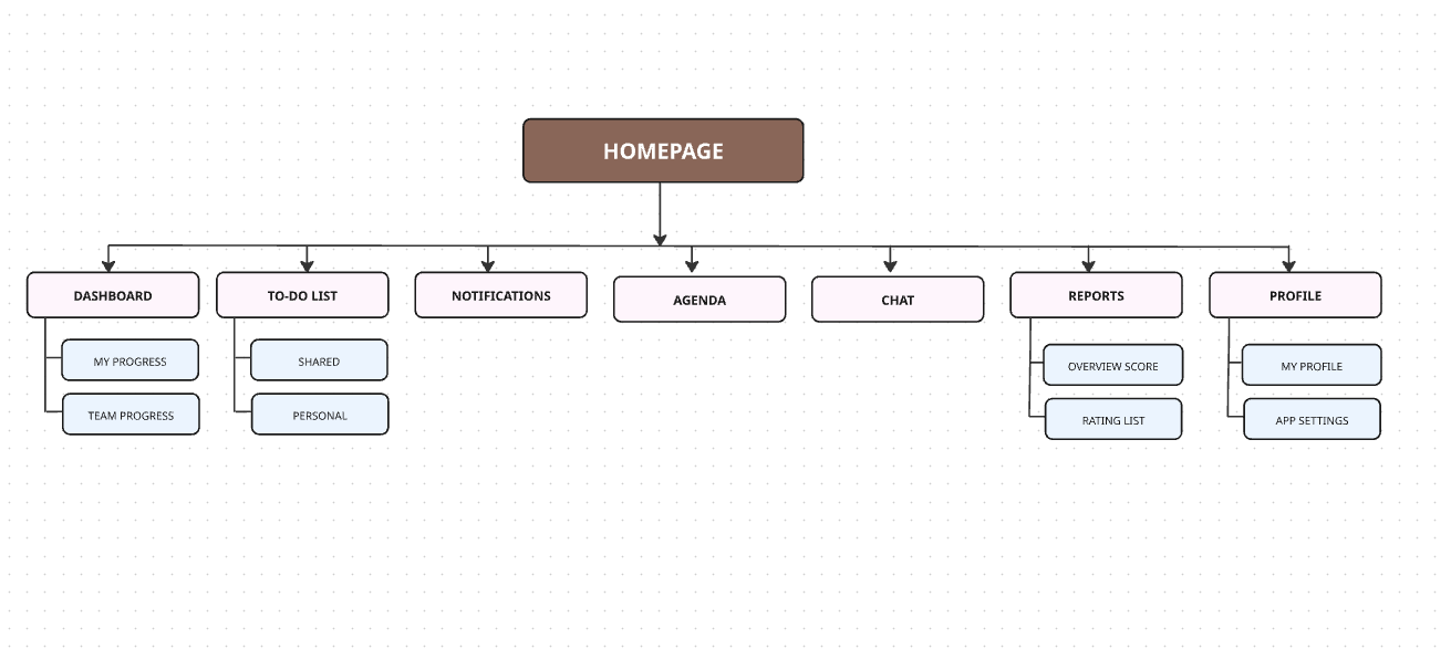
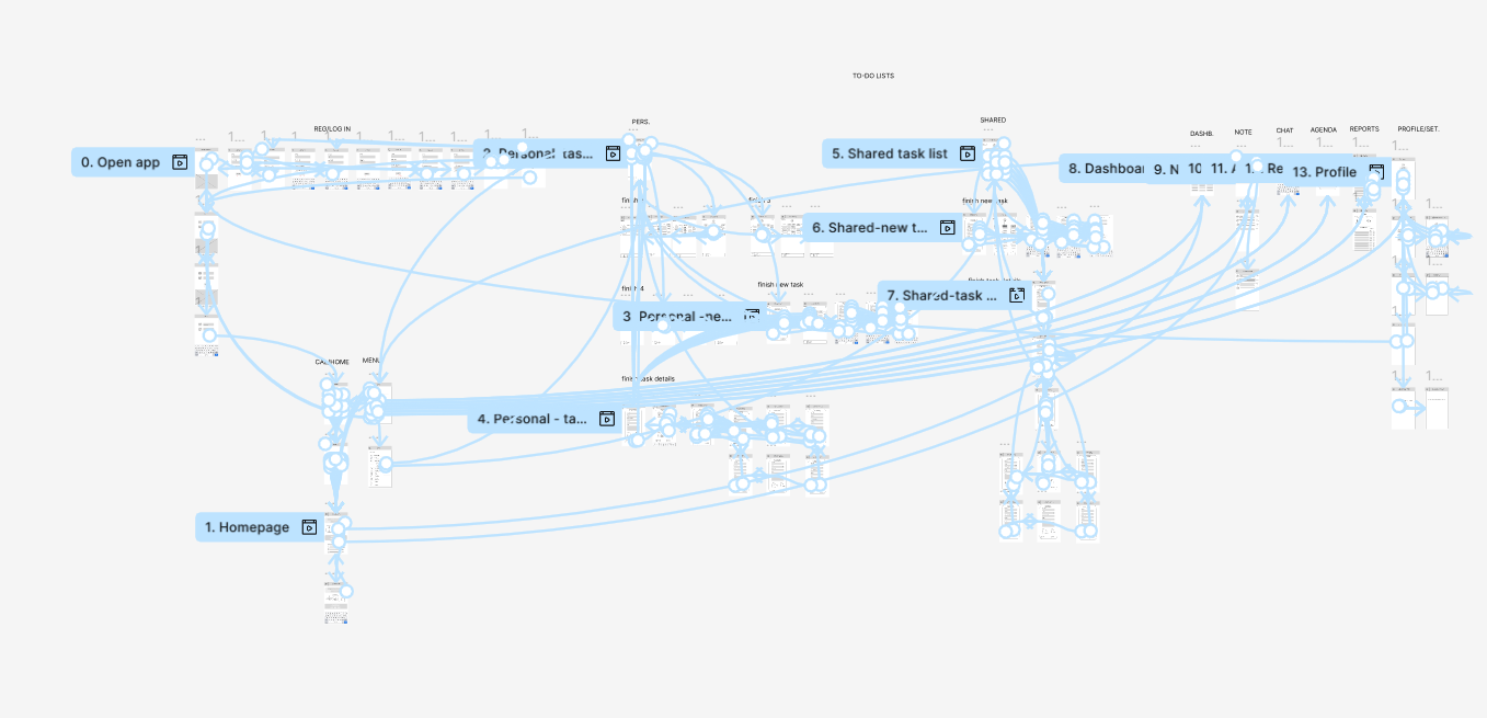
Information Architecture
Before sketching the visual concepts for the app, I first created the Information Architecture to organize the content and ensure a clearer structure for the visual design phase.
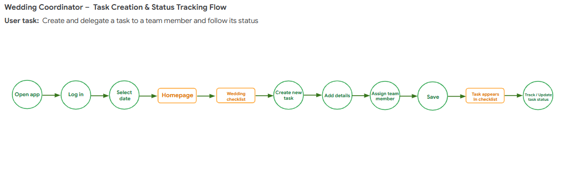
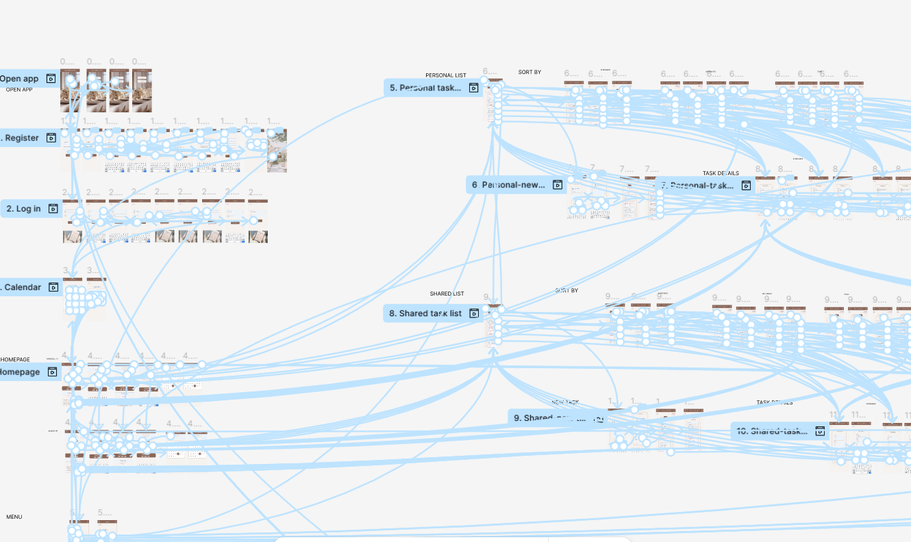
User Flow
After defining the Information Architecture,
I mapped out key user flows to ensure intuitive navigation and logical task progression.
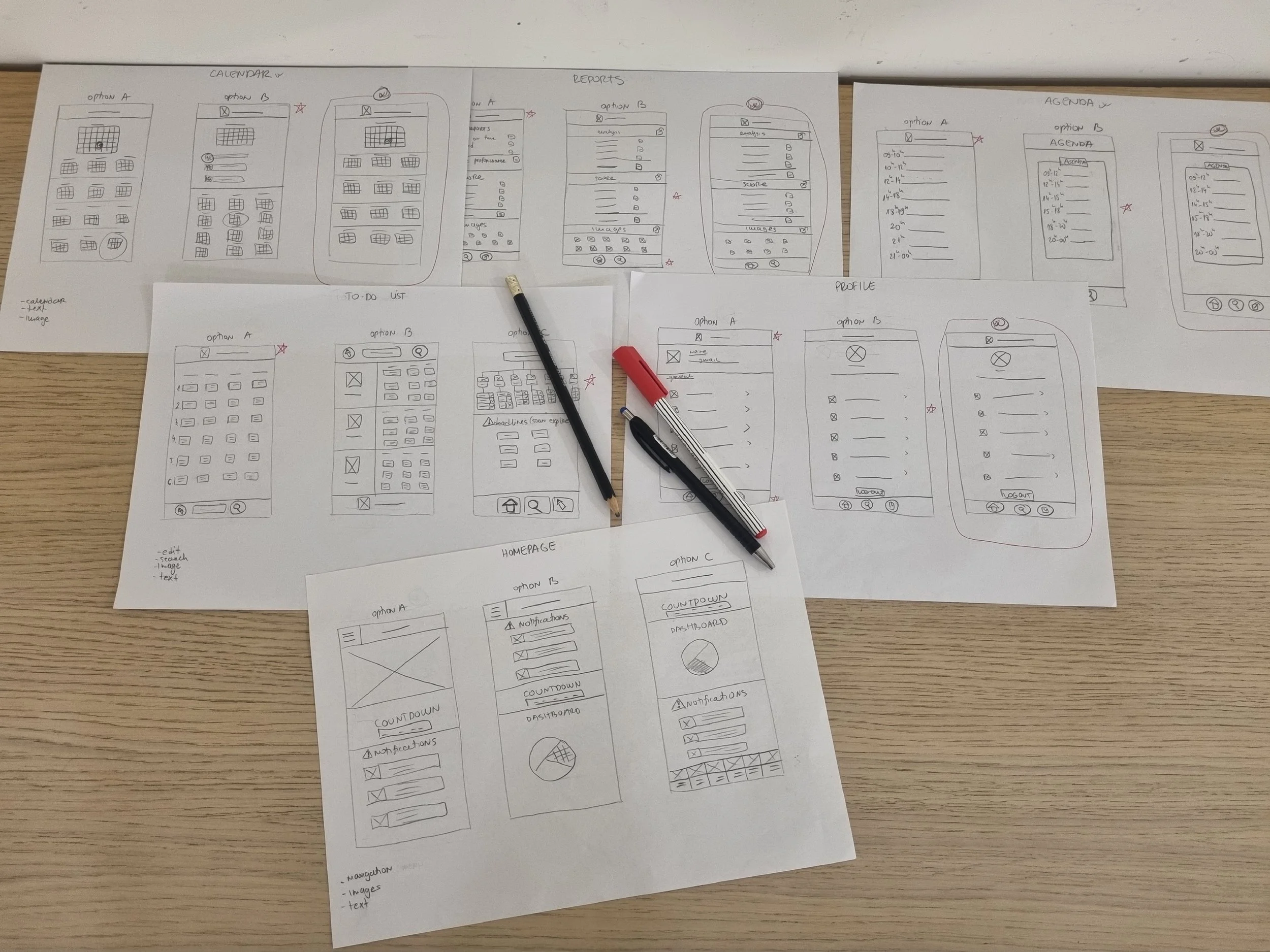
Paper wireframes
Paper wireframes helped me boost my creativity and quickly sketch ideas.
My goal was to define the navigation and create screens that I later used as the foundation for designing in Figma.
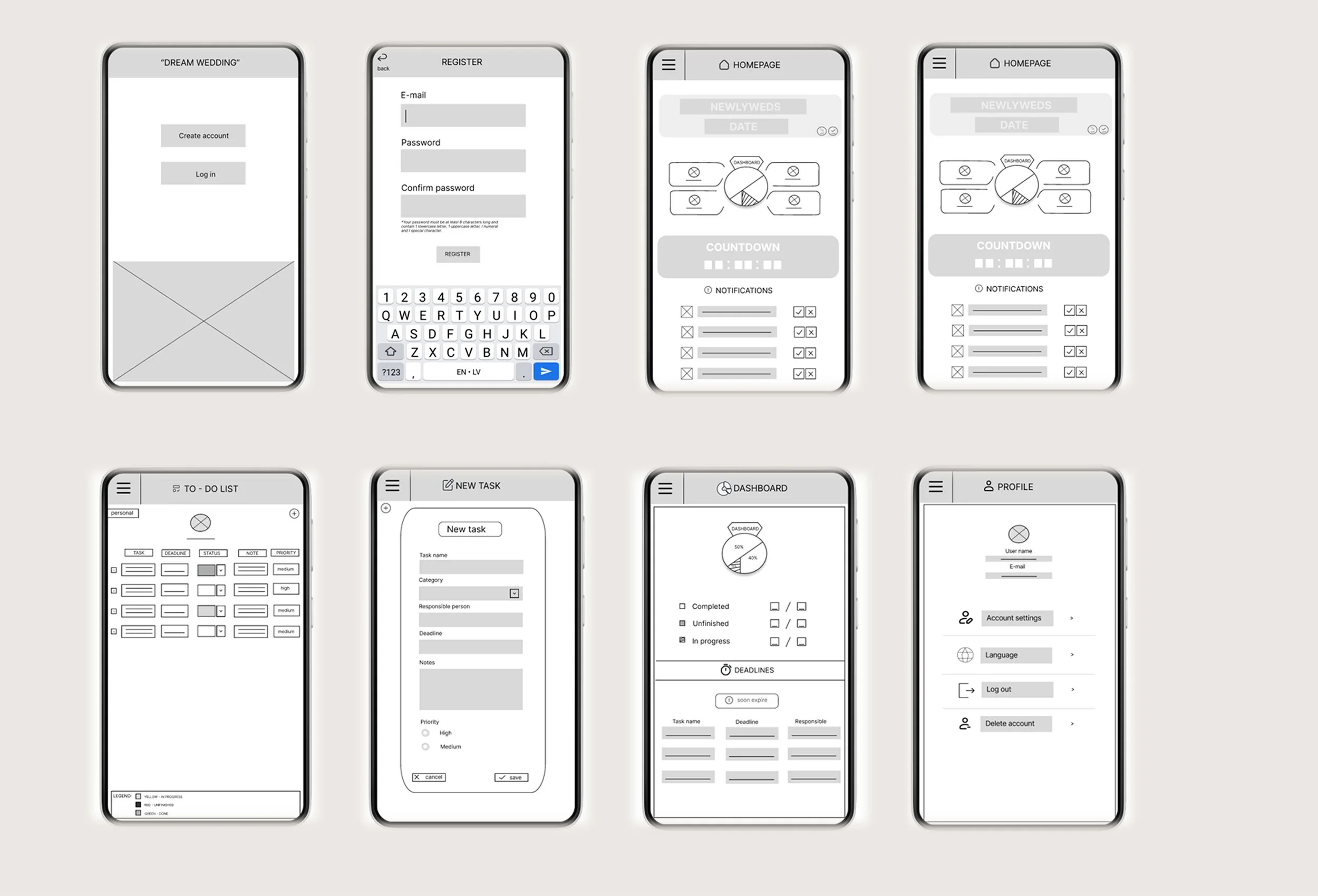
Digital wireframes in Figma
When designing the screens in Figma, my goal was to transfer all key information from the paper sketches and establish a strong foundation for further design development, while also considering Gestalt principles for grouping elements within the app screens.
LO-FI prototype
By connecting the screens into a structured flow, I developed a low-fidelity prototype to test clarity and navigation.
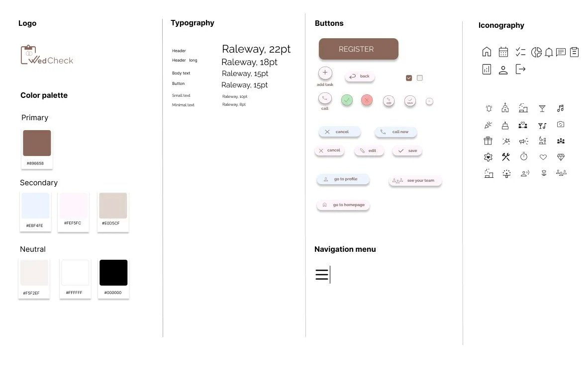
Design System
After improving the low-fidelity prototype, I created a design system, which laid the foundation for bringing the design to life and developing the final mockups.
Soft, neutral palette to reduce cognitive load during complex wedding planning tasks
High contrast to improve readability and accessibility
Clear text labels to support recognition over recall
Strong visual hierarchy to emphasize primary actions
Consistent typographic scale to reinforce information hierarchy
Visual & Interaction Rationale
Mockups
After defining the design system, I created mockups for all app screens.
It was exciting to see the product come to life through the use of color and visual elements.
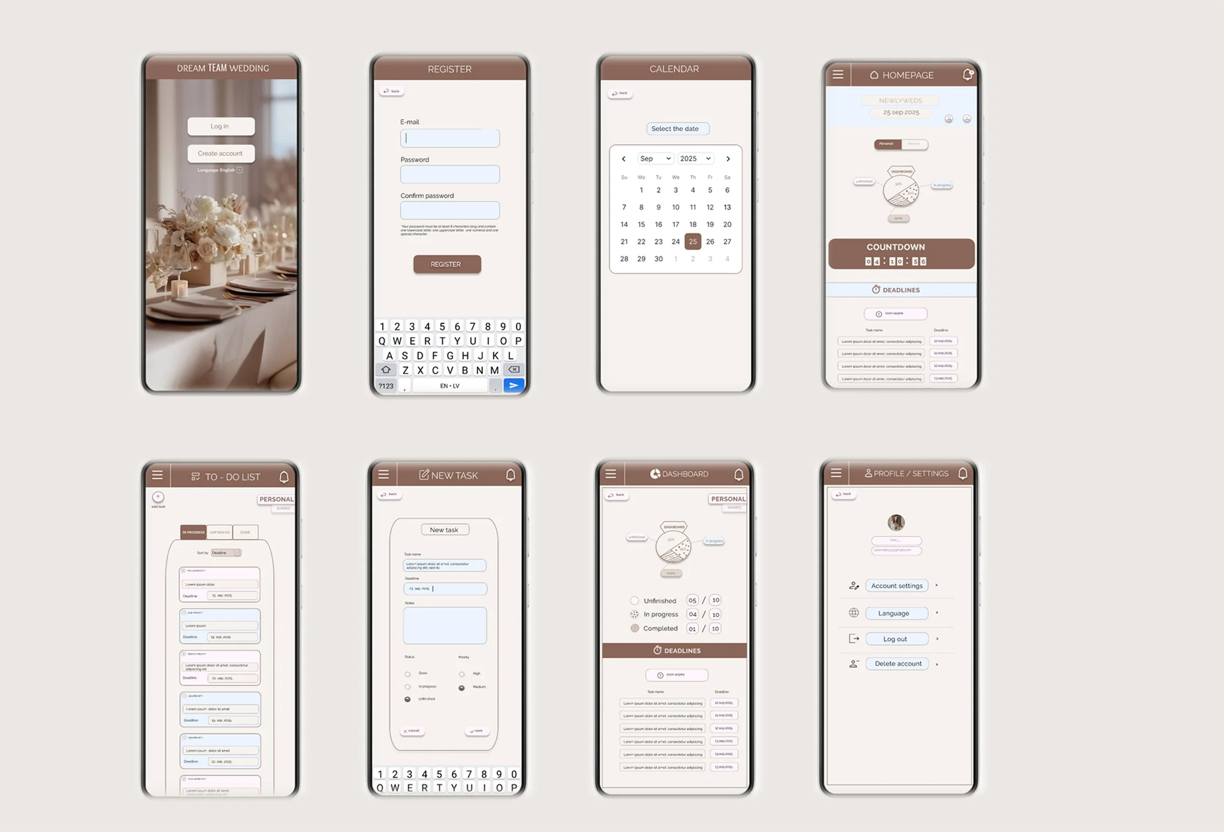
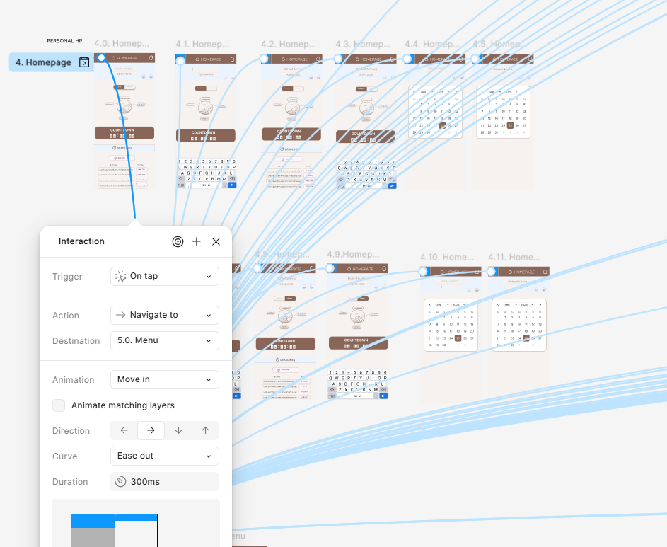
HI-FI prototype
Using a high-fidelity prototype with interactive screen transitions, I simulated real user interactions to test navigation clarity and overall app functionality.
4. TEST & ITERATE
Validating design decisions through real user testing and iteration
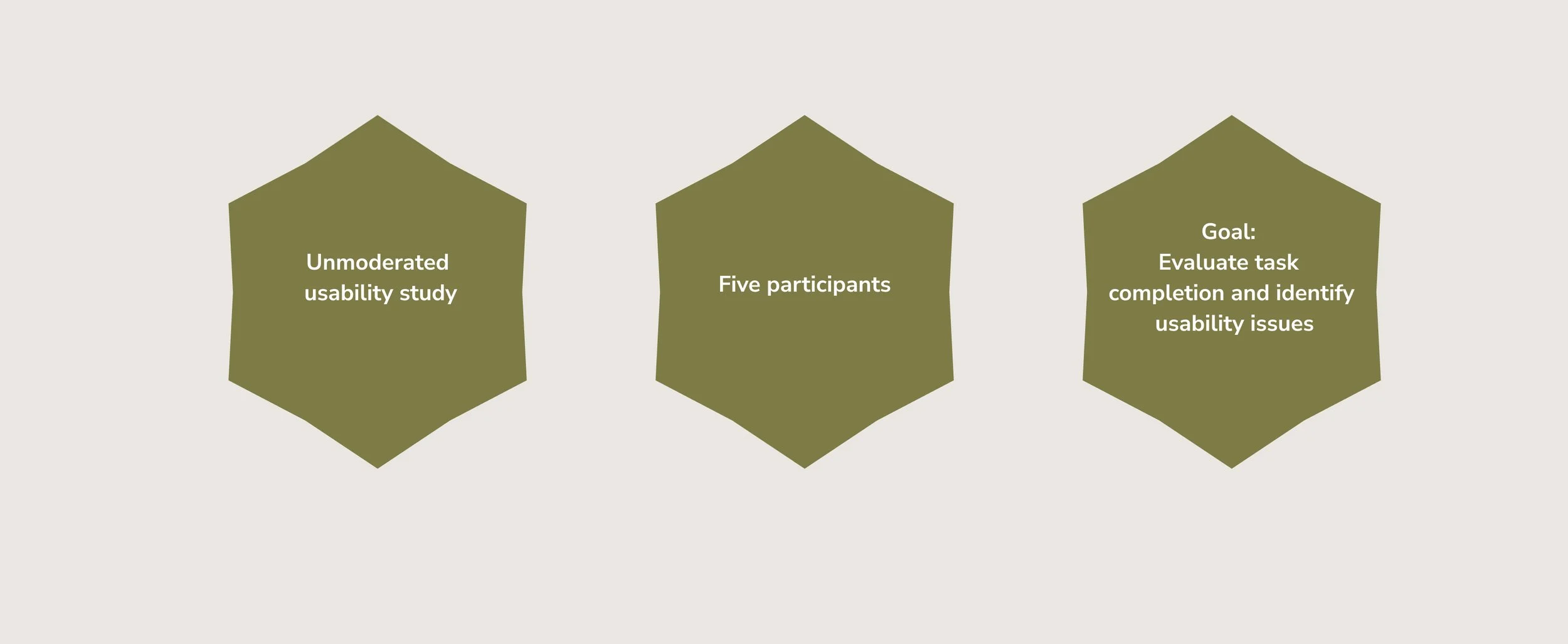
Before conducting the usability study, I created a UX research plan in which I clearly defined the objectives, participants, methodology, KPIs, and key research questions.
During the sessions, I carefully observed user behavior and their comments, paying special attention to the differences between what they said and how they actually used the application.
Usability Study - Round 1
(lo-fi testing)
The first usability study focused on identifying major usability issues and uncovering pain points.
Key findings
3 of 5 participants struggled with the password re-entry step in the registration flow
2 of 5 participants looked for a language selection option before registration
2 of 5 participants struggled to locate the “add task” action in the TO-DO list
2 of 5 participants struggled to navigate back from the account settings section
2 of 5 participants requested better structure and filtering in the TO-DO list
What has been improved
Simplified the registration flow
Added language selection at the start
Improved the visibility of the “add task” button and added a label
Improved back navigation within the ‘‘account settings’’ section
Introduced filtering options in the ‘‘TO-DO list’’
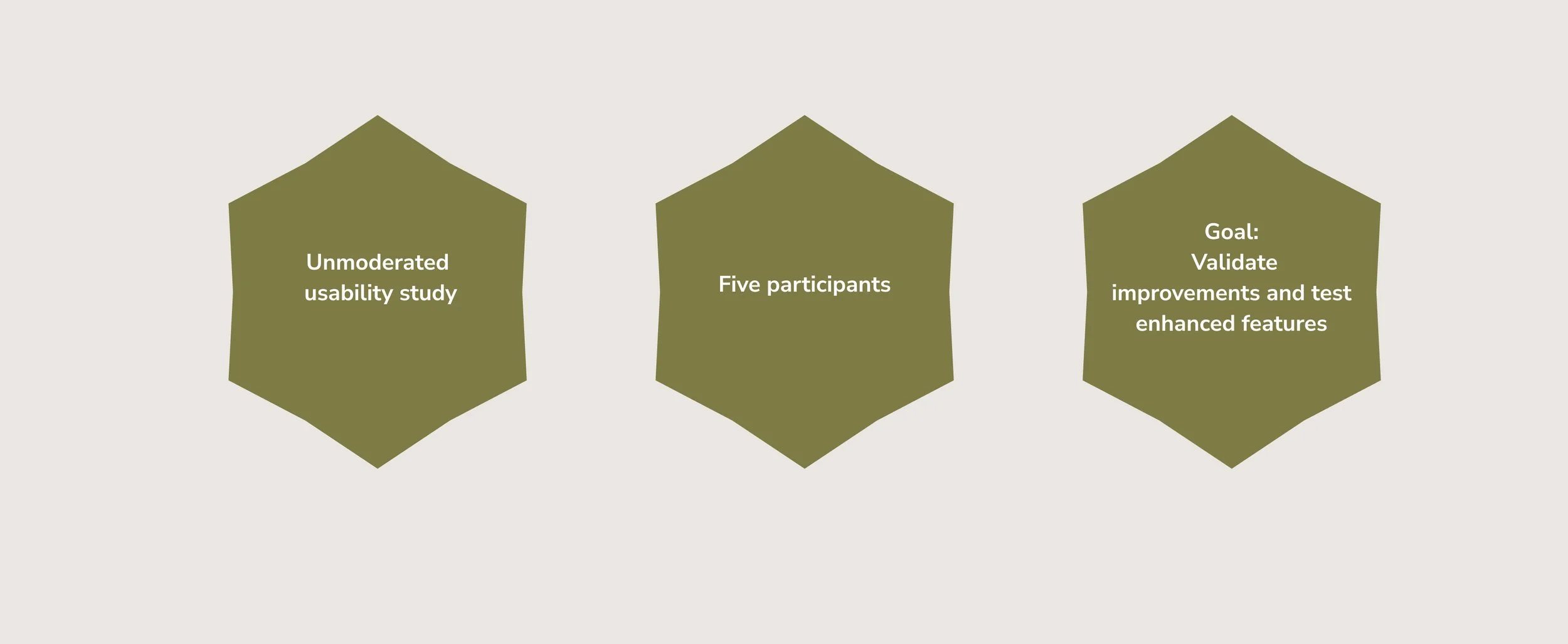
Usability Study - Round 2
(hi-fi testing)
The second usability study focused on validating improvements made after the first round and testing newly introduced features in the high-fidelity prototype.
Key findings
4 of 5 participants were unsure about the purpose of the “deadlines” button
3 of 5 participants struggled to locate the “personal list” in the navigation menu
3 of 5 participants struggled to find the option to edit their profile photo
2 of 5 participants were confused when updating task status due to unclear screen transitions
2 of 5 participants were unsure how to use the deadline field when adding a new task
What has been improved
Connected and clarified the “deadlines” button on the homepage
Strengthened visual cues for the ‘‘personal list’’’
Redesigned the profile picture update to be more intuitive
Fixed TO-DO status flow transitions
Improved the clarity of the deadline field when adding a new task
5. FINAL SOLUTION
From insight to polished design
TAKEAWAYS
Working on my first project “WedCheck” further highlighted the importance of carefully observing real user behavior during research and validating ideas through prototype testing. Iterative testing proved essential in identifying friction points and ensuring that the solution moved in the right direction.
Continuously revisiting initial assumptions in relation to the core problem helped keep user needs at the center of every design decision and allowed the product direction to evolve when necessary.
The final version of the app successfully addresses the primary coordination challenges identified during research. Future iterations could further expand the experience by introducing features such as budget tracking, venue selection, vendor integration, and guest list management.
For me, UX is the heart of the product – unseen, but deeply felt. UI is the face of the product – what captures us at first glance.
If you would like to access my final prototype or share feedback on the project, feel free to email me at: milicaurosevic.uxui@gmail.com